
Digital Health Screener
Ensuring UCSF employees return to work safely with the help of a digital health screener.

PRODUCT DESIGNER (March 2021 - January 2022)
Challenge
How do we ensure our employees can return to work safely amid the pandemic?
One of many solutions to address the challenge
Provide employees an opportunity to screen their symptoms before coming on site and get up-to-date covid HR-related resources using a digital health screener.
Our impact
Helped reduce exposures at work especially during the Winter 2021 surge.
Helped identify people with early symptoms or exposures across UCSF and how we compare to state and county level.
After iterating on the product, we increased compliance rate of pre-screening from 65% to 80%.
The Messy
DESIGN PROCESS
CLEARING THE FOG
Navigating ambiguity through conversations
Our first task was to understand the goals of the health screener, the business value, and implications of replacing an existing survey tool with a new tool that is more robust and cost-effective through interviews and workshops.
After speaking with our stakeholders, we created shared goals including:
Ensure all individuals coming to UCSF buildings have screened for COVID-19 status
Minimize monitoring/screening of individuals at the entrance
Monitor compliance and identify trends
Screening should be integrated with activities such as testing and return to work restrictions
Inclusive and accessible tool that provides multilingual support
Goals setting, tradeoffs, and considerations.
SETTING THE RIGHT DIRECTIONFraming the problems with our team
Once we set the purpose that our UCSF community are trying to address, we grouped together the different areas within the solution that we want to address. More often than not, this requires thinking beyond the technology. It could also include management metrics and change management.

Framing the problems with our team.

Working with team to understand the data flow.
Observing and learning from people in the front line
Our design strategist conducted interviews with front-line employees, providers who have shifts longer than 24 hours, and the Covid-19 task force who make policies based on data.
Synthesizing information
Our design strategist laid out a blueprint that includes all of the touch points. This was an important artifact for me to understand the flow and create wireframes based on the different touch points. We also discussed the technical data flow so I can create the interactions understanding how the information will flow and where the data will come from.
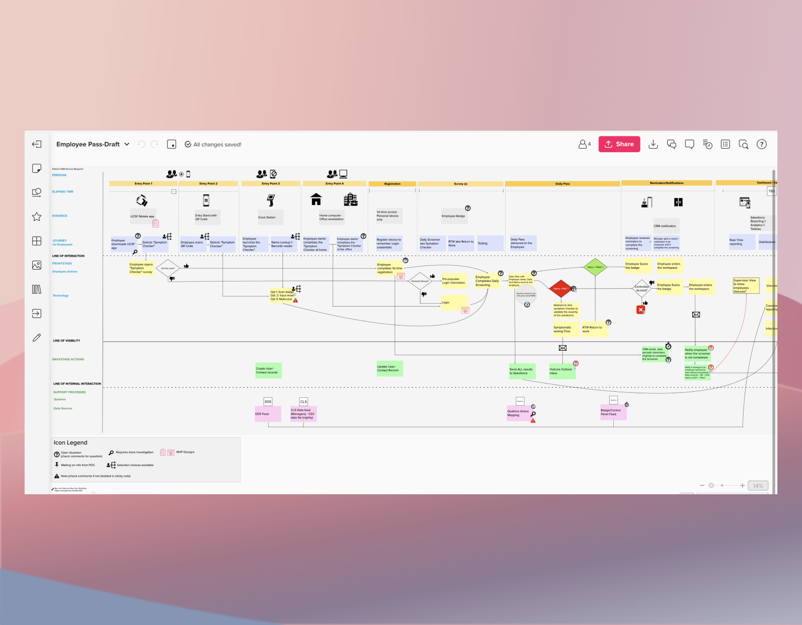
Working with design strategist to understand service blueprint.
UNANTICIPATED BARRIERSBalancing sense of urgency and building the right thing
Because this tool needed to be deployed as early as possible, there was minimal testing that was done on the design. We all understood the risks and tradeoffs, but ultimately, making this tool available quickly was more important than perfecting and testing the design.
Relying on design fundamentals and heuristics made me more confident that this was somehow going to be a usable thing, even if there was limited user testing.

Low-fidelity mockups with limited testing
SPEEDING AHEAD
Build and Craft Intentionally
I designed the high-fidelity wireframes that covered all of the touch points and edge cases including:
Responsive daily screener UI that is available in three different languages
UI that clearly visualizes the input and output of data from the time a user scans their badge to getting their status (pass/fail/pass with restrictions), including the appropriate logic based on eligibility criteria.
Reminder notifications via email and SMS.
Ability to allow employees who work more than 24 hour shifts to extend their passes.

Final mockups after two iterations.

Final mockups after two iterations.

Email reminder triggers based on time of badge entry. Email reminder also includes supervisor.
Move Between Concrete and Abstract
I relied on my team members (project manager, engineers, solutions architect) to help me zoom in on the details of the project to help me pay close attention to UI and UX changes.
On the other hand, I relied on our client and other stakeholders to help me zoom out to see the long-term sustainability plan for the product and how this will impact any design decisions we make now.

Zooming in while zooming out - understanding user stories that need to be built while using roadmaps to understand how to design in the near and long term.
Communicate deliberately
Though it seemed like a blur now, here were some of my proudest moments:
I worked hand-in-hand with the development team to advocate for the user and ensure that the designs are carried throughout every sprint
I collected feedback where I could (reports, client feedback, user feedback through client and my internal team)
We worked with Labor and Employment Relations to align content/messaging with current policies.
We deployed features to COVID-19 Leadership Task Force aligned with success metrics.
We kept communication open to ensure we are responding accordingly and swiftly, especially around COVID-related changes in policies.
LOOKING BACK... TO LOOK AHEADFinal product / Digital Health Screener MVP
Key takeaways from this project:
Finding the right balance between urgency and building something that’s good enough was key.
Ability to be a lot more nimble and agile in our development process (early demo with real data so we can test it out to users for feedback) to accommodate time-sensitive changes.
Establishing an escalation process to prioritize desire changes.
There were too many decision makers. Holding 1-2 people accountable as product owners made a huge difference with our cadence.
Next steps:
Explore how to adapt this tool to other employee screeners, such as influenza.
Understand sustainability after COVID mandates are lifted.